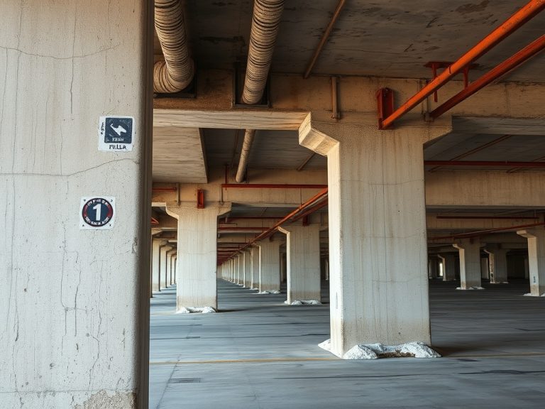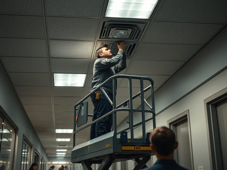
Interior signage during renovation should help people move safely, understand temporary changes, and recognize finished spaces without turning the building into a confusing patchwork of signs. Renovations disrupt familiar routes. Good wayfinding keeps occupants, visitors, deliveries, and service teams oriented while construction zones, entrances, elevators, restrooms, and departments shift.
Key Takeaway: Use the article's checklist to turn interior signage renovation into a practical review of scope, risk, schedule, and handoff requirements before work begins.
Design for Temporary Confusion First
People do not read signs carefully when they are late, distracted, or carrying materials. Temporary signage should be simple, visible, and consistent. It should answer the next decision: Where do I enter? Which elevator works? Is this corridor closed? Where is the restroom? Where should deliveries go?
The best renovation signage is planned before the first barricade goes up. It should match the phasing plan, fire and egress requirements, accessibility needs, and building communication style. A neat wall graphic cannot fix a confusing detour if the route itself is poorly planned.
Separate Life-Safety Messages From Branding
Safety, egress, hazard, and closure signs should be unmistakable. Decorative wall graphics, tenant branding, and project storytelling should not compete with warnings or directional information. OSHA construction rules address signs, signals, and barricades in specific contexts, and local code or facility requirements may add more direction.
Accessibility also matters. The U.S. Access Board provides guidance connected to ADA standards, and project teams should confirm which requirements apply to permanent signs, tactile characters, mounting locations, contrast, and accessible routes.
For additional technical context, teams can compare project assumptions with U.S. Access Board ADA standards guide and OSHA signs, signals, and barricades standard, then verify what applies locally before using those resources as a project requirement.
Plan the Sign Family, Not One Sign at a Time
A sign family includes temporary detour signs, room identification, department signs, elevator notices, restroom signs, delivery routing, construction-zone warnings, and final environmental graphics. Consistent colors, arrows, symbols, placement heights, and wording help people trust the system.
During exterior or envelope work, interior routes may change because staging, sidewalk protection, or roof access affects the building. Coordination with facade access maintenance safety can keep interior notices aligned with exterior work zones.
Phase Boards and Occupant Updates
A renovation often needs two communication layers. Directional signs answer immediate movement questions, while phase boards or digital notices explain what is changing and when. The phase information should be short, current, and written for the people using the building, not for the project team.
Outdated notices create mistrust. If a sign says a corridor reopens on a date that has passed, occupants may stop believing the rest of the wayfinding system. Assign one person to remove or update temporary messages as the project changes.
Interior signage, wayfinding, and wall graphics Table
| Sign type | Best use |
|---|---|
| Detour signs | Guide people around closures and temporary routes |
| Safety signs | Warn about hazards, restricted zones, and required precautions |
| Room signs | Identify destinations and support daily building use |
| Wall graphics | Communicate brand, project story, or visual continuity |

Finishing Details That Affect the Final Look
Permanent signs and wall graphics should be coordinated with paint colors, lighting, furniture, door swings, sightlines, and maintenance needs. A beautiful graphic placed where carts scrape the wall will not stay beautiful for long. A room sign blocked by an open door may fail even if it meets the design intent on paper.
Facilities teams should ask how graphics will be cleaned, repaired, replaced, and removed. This is especially useful in leased spaces or buildings where departments change names and room functions over time.
A Common Renovation Wayfinding Scenario
Imagine a lobby renovation that closes the main entrance for two weeks. Visitors need parking guidance before they reach the door, a temporary accessible route, a clear reception path, and notices at old decision points. If the first sign appears only at the closed entrance, the system has already failed.
Good wayfinding starts before confusion begins. It places information where people make decisions, not where the project team happens to have wall space.
Questions for the Renovation Team
Before signs are printed, ask which routes change in each phase, how accessible paths are marked, where delivery drivers should go, and who removes outdated signs. Ask whether the final sign package will match the temporary language people have learned during construction.
This small coordination step can reduce confusion and prevent temporary decisions from weakening the finished visitor experience.
Testing the Route Before Opening It
Before a temporary route is released, have someone unfamiliar with the project walk it from parking, reception, elevators, restrooms, and key departments. Watch where they pause or turn the wrong way. Those hesitation points show where signage should be simplified, moved, or repeated.
Avoiding Sign Clutter
More signs do not always create better wayfinding. Too many messages at one decision point can slow people down. Use the fewest signs needed to guide the next step, then repeat information at the next turn or barrier where a new decision is required.
Wall Graphics Can Support Change Management
Wall graphics can do more than decorate. They can explain project phases, mark temporary entrances, reduce anxiety in healthcare or education settings, and help visitors recognize departments after renovation. The tone should match the building. A school, clinic, office, warehouse, and multifamily lobby each need a different level of detail and durability.
Avoid graphics that depend on small text or complex maps in high-traffic decision points. Use simple directional signs at intersections and save detailed project information for waiting areas or low-pressure locations.
Materials, Surfaces, and Removal Matter
Temporary signs may be taped, magnetized, freestanding, mounted to barricades, or applied as removable vinyl. The surface matters. Fresh paint, textured walls, glass, concrete, metal panels, and masonry behave differently. Poor adhesive choices can damage finishes or fail in humid, dusty, or high-touch areas.
Finished wall conditions also depend on the building material. In older or moisture-exposed structures, repairs may uncover substrate issues. When structural or material deterioration is involved, topics like corrosion affecting reinforced concrete and steel should be handled by qualified professionals before graphics or finishes hide the problem.
Renovation Wayfinding Checklist
- Map temporary routes for occupants, visitors, deliveries, emergency access, and maintenance teams.
- Keep safety and closure signs visually separate from decorative or promotional graphics.
- Confirm accessibility requirements for applicable permanent signage.
- Use consistent arrows, colors, wording, and placement throughout each phase.
- Remove outdated temporary signs immediately after a phase changes.
- Test routes with someone unfamiliar with the building before opening them to the public.
Clear Directions Through a Messy Phase
Renovation signage works when it reduces hesitation. The right system gives people confidence without overloading walls with messages. Start with circulation, safety, and accessibility, then add graphics that support the project story or finished design.
This article is informational and does not replace code, accessibility, safety, or design advice for a specific property. Before printing or installing signs, review the phasing plan with the owner, contractor, design team, and authority requirements that apply to the building.