Abstract art is not a test of whether you can spot a hidden object. It is a way of organizing color, shape, line, texture, scale, rhythm, and material so the viewer reads visual relationships rather than a literal scene.
Quick read for curious gallery visitors
The biggest mistake is treating abstract art as either a trick or a free-for-all. Major museum definitions, including Tate's explanation of abstract art, describe it as art that does not try to copy visible reality accurately, while MoMA's page on abstraction shows how abstraction can still be tied to bodies, places, emotions, systems, and ideas. That means the useful question is not "What is it supposed to be?" but "What choices is the artist asking me to notice?"
Myth one: Abstract art is just random marks
The myth sounds plausible because many abstract works avoid recognizable subjects. Yet most strong abstract art is built from deliberate decisions about balance, contrast, repetition, edge, density, color temperature, and surface. A brushstroke can be loose without being careless. A grid can look simple while carrying decisions about proportion and tension. A nearly empty canvas can make spacing, scale, and material more visible because there is less narrative detail to distract the eye.
The downside of this myth is that viewers stop looking too early. They glance, decide the work is random, and miss the visual structure. A better approach is to scan the work slowly: where does the eye enter, where does it pause, where does it meet resistance, and what changes when you step back? This same patient viewing habit can also help when reading about myths around expensive gear, because tools matter less than the decisions made with them.
Myth two: Anyone could make it, so it has no value
"I could do that" often confuses physical simplicity with artistic ease. Some abstract works are hard because they require restraint. Others are hard because the artist has to make intuitive choices feel inevitable. A child can draw a line, but that does not make every line drawing equivalent. The question is not whether the action could be copied in isolation. The question is whether the whole work has coherence, pressure, surprise, and visual purpose.
This does not mean every abstract work is automatically successful. Viewers can dislike a piece, find it thin, or think it fails. The honest distinction is between a critical judgment and a dismissal based on a shortcut.
| Oversimplified claim | More useful reality | What to look for instead |
|---|---|---|
| It is random | Many works use controlled rhythm and visual tension | Repetition, contrast, edge, weight, and spacing |
| It has no subject | The subject may be visual, emotional, spiritual, political, or material | Mood, structure, gesture, scale, and context |
| It needs a secret meaning | Some works reward open-ended looking | Your changing response from close up and far away |
| It is only for experts | Knowledge helps, but slow looking helps too | One formal choice you can describe clearly |
Image Placeholder 1: Abstract gallery viewing scene
Myth three: Abstract art has one hidden meaning
Some works have documented references or artist statements. Others are designed to remain open. Treating every abstract painting like a puzzle with one answer can make the viewing experience smaller. It pushes viewers to hunt for a key instead of noticing how the artwork behaves in real time.
A sound interpretation uses evidence. If a work's colors suggest heat, say that they may create a sense of heat. If repeated forms feel architectural, say that they can be read as architectural. Avoid claiming the artist "meant" something unless the claim is supported by a direct statement, label, interview, or credible scholarship.
Myth four: Good abstract art must be difficult
Difficulty can be part of the experience, but it is not the goal by itself. Some abstract works are immediate. Others become interesting after repeated viewing. A painting can be quiet, playful, severe, decorative, confrontational, or meditative. The range is wider than the stereotype of the blank canvas with a dense wall label.
For beginners, the best entry point is to describe before judging. Name three things you can see: a pale field, a rough surface, a diagonal pull. Then describe what those choices do. This moves the response from "I do not get it" to "I can identify what is happening, and I can decide whether it works for me."
Myth five: Context ruins the experience
Some viewers worry that reading labels or art history will force them to see the "correct" answer. In practice, context can widen the experience. Knowing that abstraction developed in relation to photography, modern design, spiritual inquiry, war, migration, technology, or performance can help viewers understand why artists moved away from direct representation.
Context should not replace looking. It should return you to the object with better questions. A useful label does not tell you what to feel. It gives you a frame for noticing why certain formal decisions might matter.
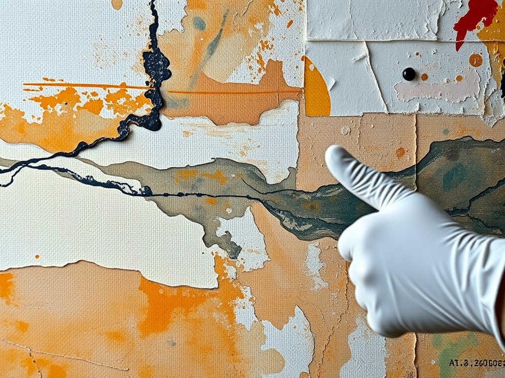
Image Placeholder 2: Close view of abstract painting materials
Myth six: Abstract art is disconnected from craft
Abstract art often makes craft more visible, not less. Canvas weave, pigment thickness, erased marks, stains, seams, paper fibers, and installation scale become part of the work. In sculpture and installation, material decisions may be even more obvious: steel bends, glass reflects, fabric sags, projection light spills, and sound changes the room.
This is why collectors, donors, and institutions care about documentation and care. The process of donating artifacts, papers, or collections depends partly on understanding materials, provenance, and long-term preservation, not just whether an object looks impressive.
A better way to stand in front of abstraction
Start with what is visible. Move from description to interpretation. Ask how the work changes with distance. Notice the title, date, materials, and scale. Then let yourself form a judgment that is specific rather than defensive. "The color feels unresolved to me" is a stronger response than "this is nonsense." "The surface keeps pulling me back" is more useful than "I get it."
Abstract art becomes less intimidating when it is treated as a visual language rather than a private code. The next time a work seems too simple or too strange, give it two minutes before deciding. The reward is not always liking it. The reward is learning to see more carefully.